The Train Window Grade: Making UK Brand Films Survive Daylight
There is a very specific disappointment that arrives when a client watches the finished brand film on their phone, at 11am, beside an office window. On the grading monitor it had depth, shape and a lovely bit of atmosphere. On the phone it looks like someone has gently breathed on the lens. The colours are thinner, the shadows have gone missing and the skin tones have drifted towards a vague, polite beige.
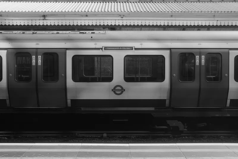
That is not a failure of craft. It is a mismatch between where we grade and where the film actually lives. In the UK, that viewing environment is rarely a dark cinema. It is a train carriage heading north, a café table by the glass, a meeting room with the blinds half up, or a phone held at an angle while someone walks through a station concourse. If we want the work to hold up, we need to grade for the train window as well as the suite.
Start with the screen in the room
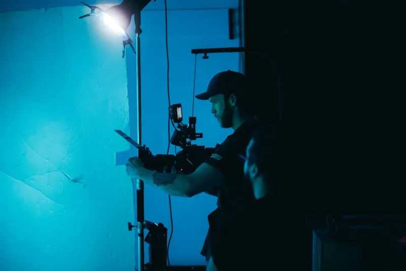
The fix begins before the grade. On set, it helps to treat the phone as a reality check rather than the enemy of the monitor. Keep the main exposure decisions on proper monitoring, but add a quick phone pass at natural brightness. Not to judge the final look — that would be madness — but to catch the things that disappear first: white shirts, window detail, pale walls, bright signage and any skin tone that is already sitting close to the clipping point.
Use false colour or zebras to protect the highlights you actually care about. In a UK office shoot, that often means the view through the window, the glow of a monitor, or a practical light in the corner. Protect those, then expose faces so they sit comfortably in the upper midtones. If the skin is already hot on set, no grade will make it feel relaxed later.
A simple on-set habit: after the monitor check, grab a phone, set it to around half brightness and look at a frame with a face and a window in it. You are not looking for beauty. You are looking for survival. Can you still see the shape of the cheek? Does the window have any texture? Does the shot feel like it has a centre of gravity? If not, adjust the lighting or exposure before you move on. It is much easier to solve on the day than in the grade.
Two grades, one story
The most useful approach for UK brand films in 2026 is a two-grade strategy. The first is the cinematic master: the version for the website hero, the screening room, the conference playback and any environment where the viewer is giving the film proper attention. This is where you can let the shadows sit deeper, keep the contrast elegant and allow the colour to have a bit of mood.
The second is the social-safe version. Same story, same grade language, but built for phones in daylight. That usually means lifting the shadows slightly so they do not collapse into black, softening the brightest highlights so white text and windows do not bloom, and adding a little more midtone separation so faces still read at a glance. A touch of warmth in the skin is fine, but keep it on a leash. Phones already push saturation and contrast in their own way, and a grade that is too rich in the suite can look almost cartoonish on a train.
Do not think of the social-safe grade as a lesser version. Think of it as a translation. The cinematic master is the novel; the social-safe grade is the same story told for a noisy room. Both should feel like the brand. Neither should feel like a compromise.
Skin tones are the handshake
UK casts are wonderfully varied, and a single blanket warm-up will not flatter everyone. Use the scopes, but trust faces more than numbers. Check skin against the background, not in isolation. A face can look correct on its own and still feel disconnected from the room. Look for redness in the cheeks, dullness in the midtones, and any green or magenta drift that appears when the phone’s auto-brightness kicks in.
Contrast is the other moving part. Very low-contrast grades can feel soft and cinematic on a big screen, but on a phone in daylight they can turn to mush. Very high-contrast grades can feel punchy in the suite and then lose all shadow detail when the screen is fighting the sun. Aim for clear separation: bright faces, readable midtones, shadows that still have shape. If you can pause on a frame and instantly understand where to look, you are in the right territory.
A simple 2026 handover checklist
Before the film leaves the building, run a phone-first handover. It takes twenty minutes and saves a week of emails.
- Watch the social-safe grade on at least two phones and one laptop, ideally in a bright room and near a window.
- Check the first five seconds with the sound off. If the story does not land silently, the grade is not the only issue — but contrast and skin tone will be doing a lot of the work.
- Confirm the captions are readable against the brightest and busiest frames, not just the calm ones.
- Supply the master file, the social cutdowns, the stills and a short viewing note that explains the two grades and when to use each.
- Include a line in the delivery email: “For the best first impression, watch the social version at around half brightness — that is closer to how most people will meet it.”
- Keep a phone-sized reference frame in the project folder, so the next person who touches the film knows what “good” looked like in daylight.
None of this is about dumbing down the picture. It is about respecting the journey the film will take. A UK brand film might start life in a grading suite, but it will spend most of its life in someone’s hand, on a train, in a café, or beside a window that is winning the fight with the screen. Grade for that room, and the cinematic version will still feel like the luxury cut. The social version will simply make sure everyone else gets the point too.