The Quiet Close: Giving a Showreel's Final Frame the Same Care as Its Opening Shot
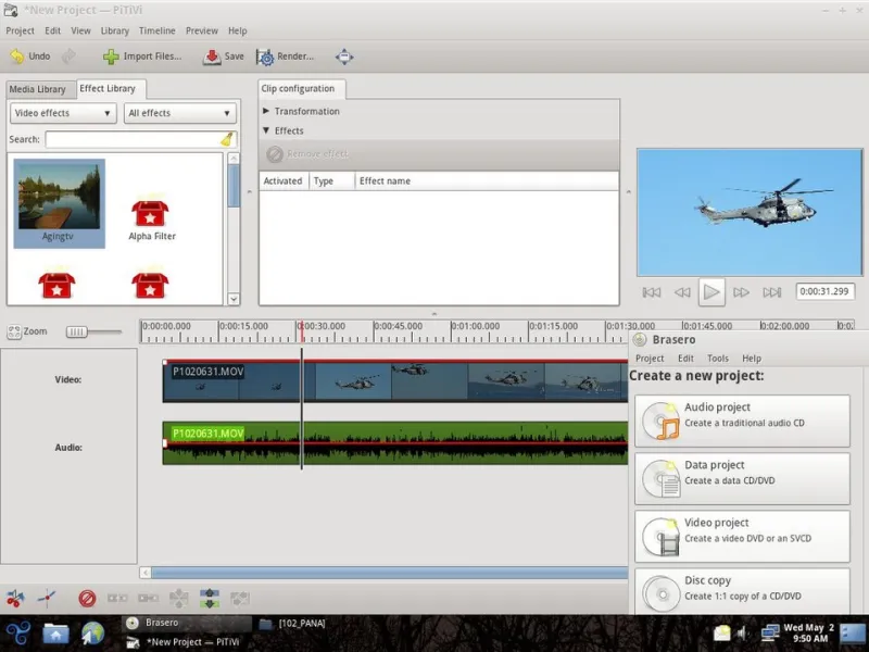
Photo: The Trisquel Project, GFDL 1.3, via Wikimedia Commons
Everyone in this trade can talk for hours about the opening eight seconds. The cold open, the hook, the first frame that stops a thumb halfway through a scroll. Fair enough — that's where attention is won. But the last five seconds are where the enquiry actually happens, and they're usually the part of the edit that gets the fewest decisions and the most last-minute fiddling from people who've run out of patience.
I've lost count of the UK showreels I've watched that are genuinely beautiful for eighty-eight seconds and then end on a hard cut to a logo, a phone number in a thin grey typeface, and a web address that's still animating out when the player loops. Cinematic all the way, then a shrug.
The Final Frame Is a Second Film
It helps to stop thinking of the end card as a title sequence in reverse. Treat it as a tiny standalone piece with one job: move somebody from watching to doing. That's a different brief from the rest of the reel. The body of the showreel is there to prove taste, craft and pace. The final frame is there to answer three quiet questions a viewer is already asking — who are these people, where are they, and what happens if I raise my hand?
Once you frame it that way, the decisions get easier. You're not decorating a logo. You're designing a doorway.
Hold the Frame Like You Mean It
The single most common mistake is cutting on the last beat of the music. It feels musically tidy and editorially rushed. Give the end card two to three seconds of stillness — the track dropping to a single sustained note, or just room tone — so the eye can actually settle and read. Anything less and you've built a billboard that flashes past at seventy miles an hour.
While you're there, watch the loop point. On most social platforms the reel restarts automatically, which means your end card briefly becomes your opening frame. If that transition looks like a stumble, soften it: finish on a frame that could plausibly open the film, and let the type fade rather than snap out.
Type That Survives the Mangle
Whatever you export gets re-encoded by every platform it lands on — and re-encoded again when somebody forwards it. Thin weights, low-contrast grey on grey, and hairline rules all disappear first. A few habits worth keeping:
- One email address, one phone number at most, one URL. Every extra line halves the chance any of them gets remembered.
- Set contact type at least as large as the largest piece of body copy in the reel, and check it at arm's length on a phone rather than on a grading monitor.
- Keep the critical information inside a central safe box. Vertical platforms stack their interface over the bottom fifth, and feed crops will happily eat the edges of a 16:9 end card.
- Skip the QR code unless the film is long, static and shown on a big screen. In a five-second close on a phone, it's a squint and a lost cause.
The Three-Beat Close
A structure I keep coming back to is proof, place, door. Three beats, roughly a second and a half each, no more.
Proof is a single line of credibility — a client name, a sector, a number that means something. Not a logo wall, which reads as noise at this length. One line, held long enough to register.
Place tells people you're real and reachable. Something as plain as based in Bristol, shooting across the UK does more work than a paragraph of positioning statement, and it quietly answers the question every producer asks first: can they get to us?
Door is the invitation. One verb, one destination. Send us a brief. Book a call. See the full reel. Pick one and commit.
Write It Like a Person, Not a Brochure
The temptation at the close is to reach for the language of a sales page. Get in touch today for a free, no-obligation quote. It undoes eighty-eight seconds of good taste in a single sentence. Compare that with something like: got a project in mind? send us a note. Same information, half the volume, and it doesn't sound like it's wearing a lanyard.
Keep it to a handful of words, lowercase if it suits the typography, and resist the urge to add a strapline underneath. If the reel has done its job, the viewer is already sold on the craft. The end card just needs to be easy to act on.
Test It the Way People Actually Watch
Before anything ships, run the close through a few unglamorous checks. Watch it muted on a phone at arm's length, which is how a good chunk of your audience will meet it. Watch it on a bright television in a sunlit room, where contrast quietly dies. Scrub to the final frame and pause — if it doesn't work as a still, it won't work as a close. Then show it to somebody outside the industry and ask what they'd do next. If they can't answer in one sentence, the end card is doing too much.
A Door, Not a Billboard
The best end cards I've seen don't feel like endings at all. They feel like the film exhaling and turning to face you. Five seconds is plenty of time to be clear, be human, and be findable — but only if you storyboard it with the same care you gave the opening shot. The first frame earns the watch. The last frame earns the reply.